 Mueen Studio
Supplement packaging · UK
Timeless Radiance
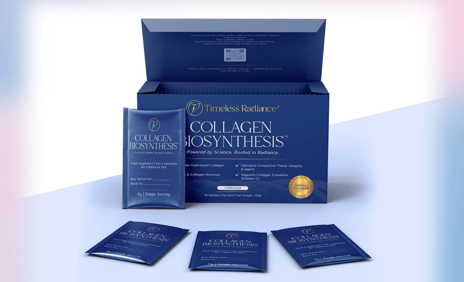
A collagen box and sachet system that carries detailed scientific content without losing its premium feel, made in Italy for a UK wellness brand.
01 / The brief & the challenge
One identity. Two formats.
A UK wellness brand focused on healthy ageing needed packaging for its collagen supplement: a 30-sachet outer box and an 11 g sachet, made in Italy. The brand supplied a detailed brief, content sheet, fonts and a collagen illustration.
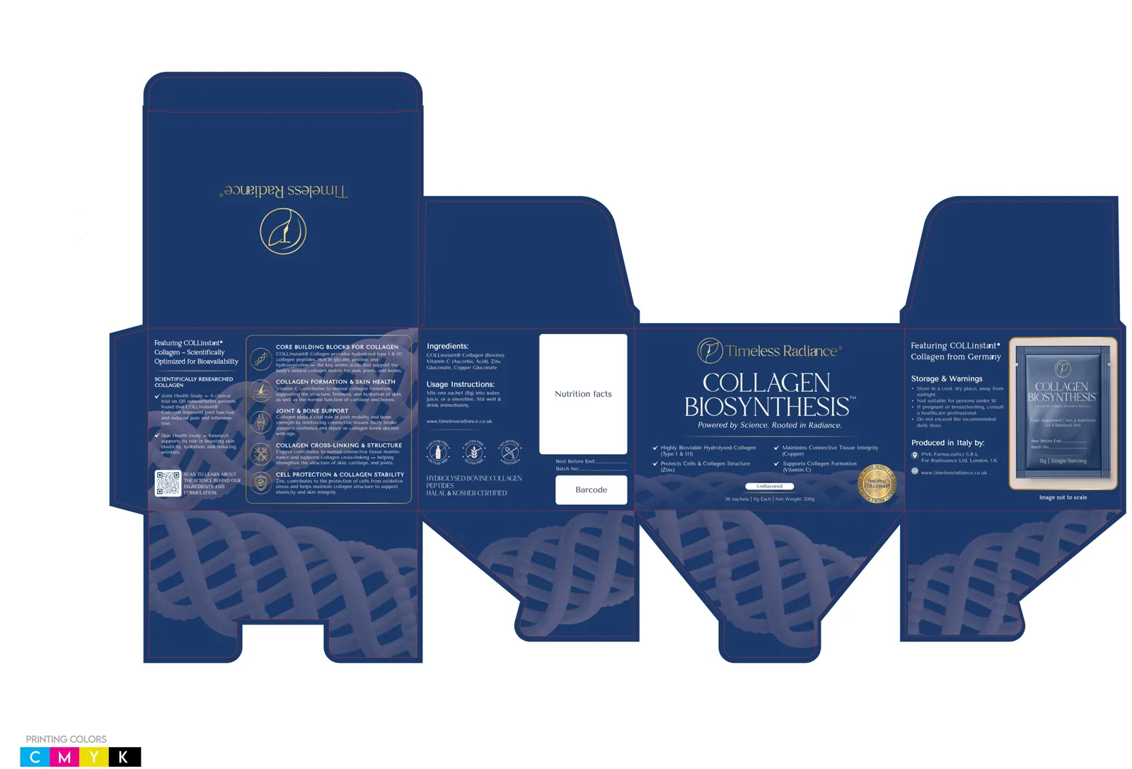
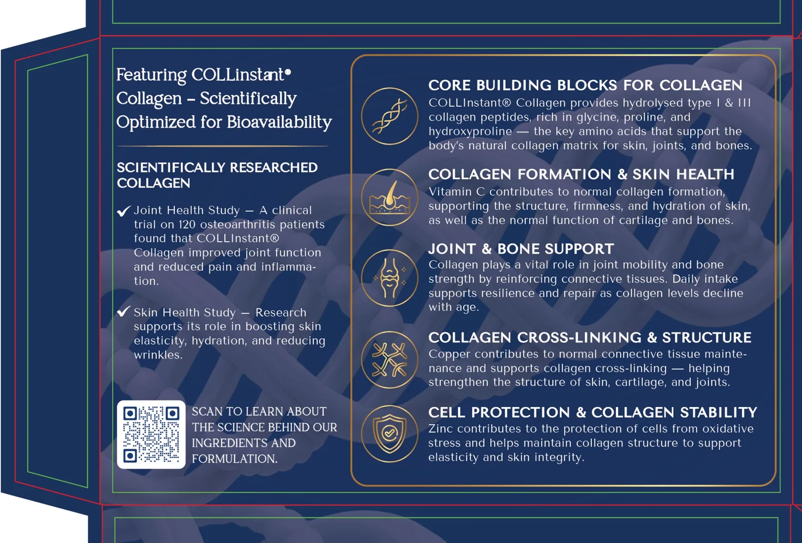
The carton had to hold benefit claims, five ingredient infographics, two study summaries, usage, storage and warnings, manufacturer details and a QR code on panels of 155 mm and 124.5 mm, while the sachet carried the same identity at a fraction of the size.
02 / Visual direction
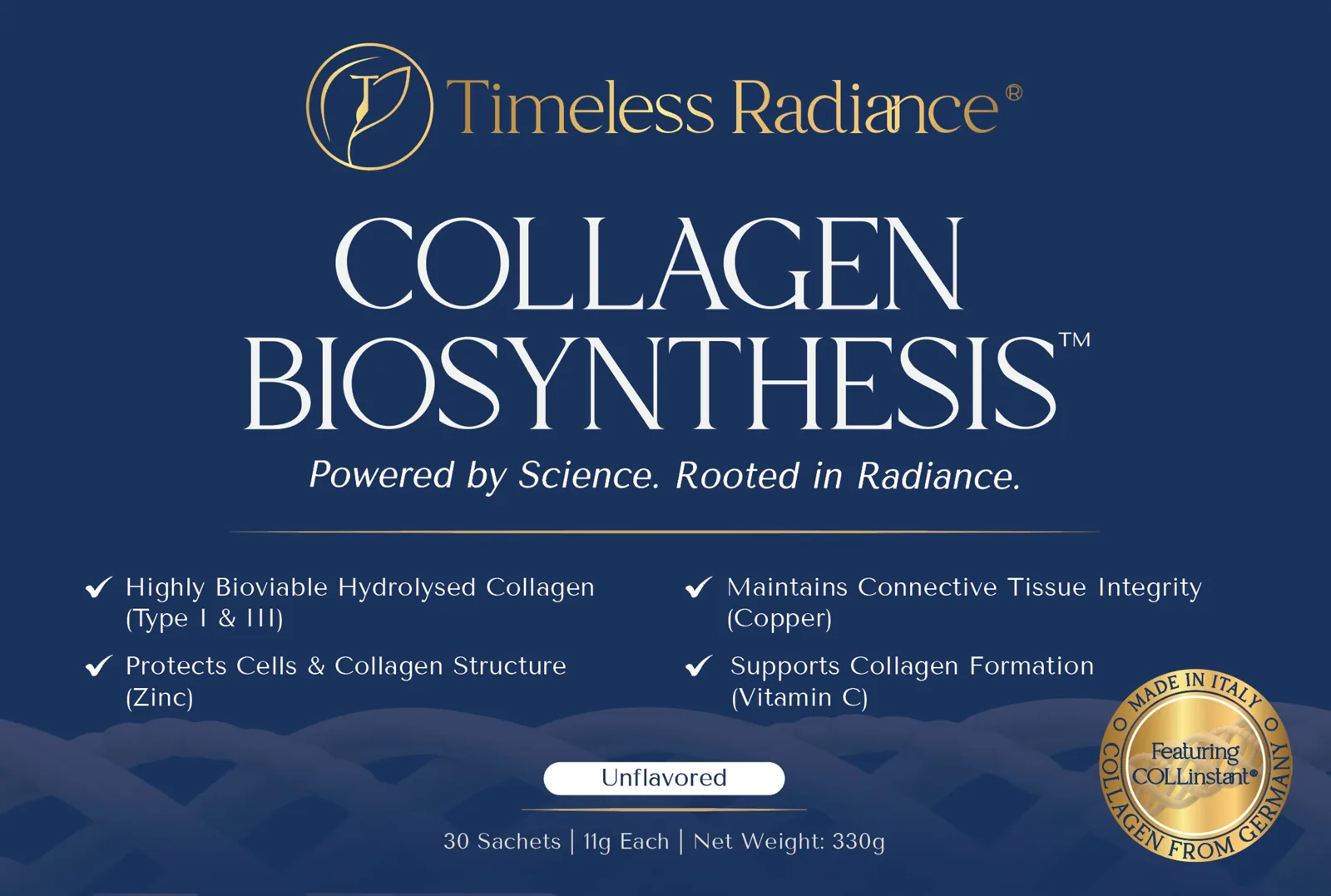
Science you can see, never in the way.
The brand wanted collagen fibrils, not generic DNA graphics. The illustration sits in pearl-white tones over deep navy, softened so it reads as texture behind the copy. Gold is reserved for the logo, product name, separator rules and the seal; all copy is white for clarity.
03 / The sachet
Consistency at a smaller scale.
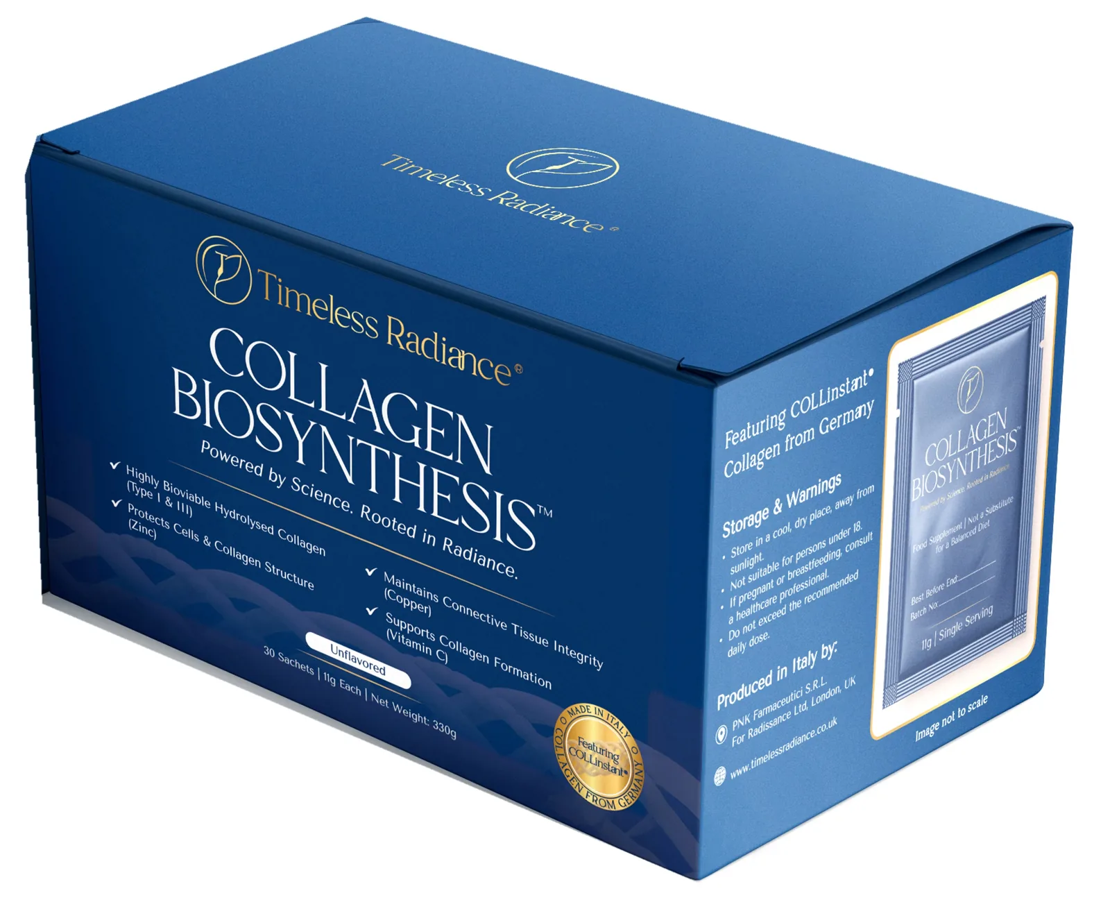
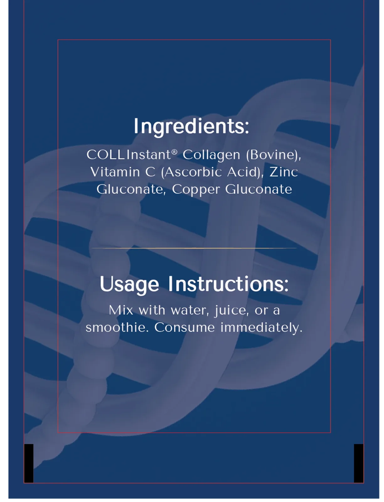
The sachet carries the same logo, name, tagline and colour system, simplified for a single serving. The front holds batch and best-before fields; the back carries ingredients and usage, matched exactly to the box.
04 / Exterior artwork
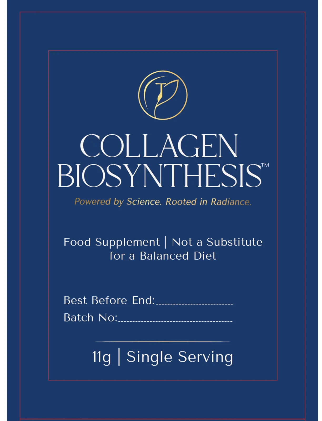
Every panel has a job.
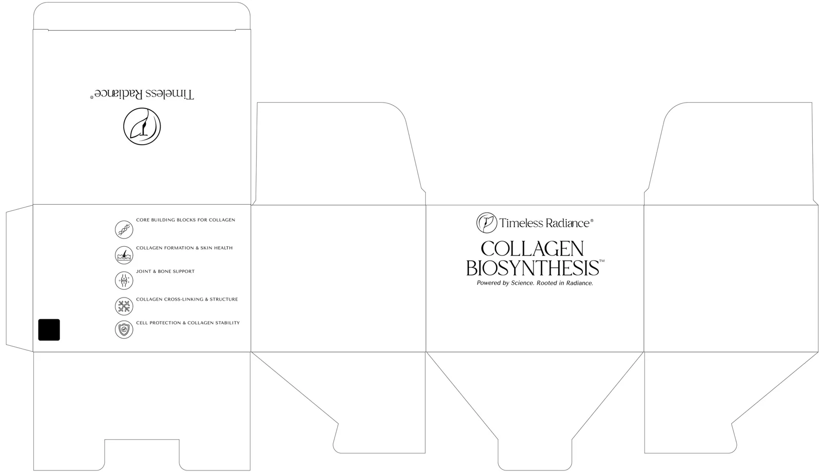
Front for recognition, side panels for science and safety, back for ingredients and usage. Nutrition and barcode areas were set as marked zones for the manufacturer, and the sachet callout is labelled “Image not to scale” for regulatory accuracy.
05 / Finishing plates
Embossing and spot UV, separated for the press.
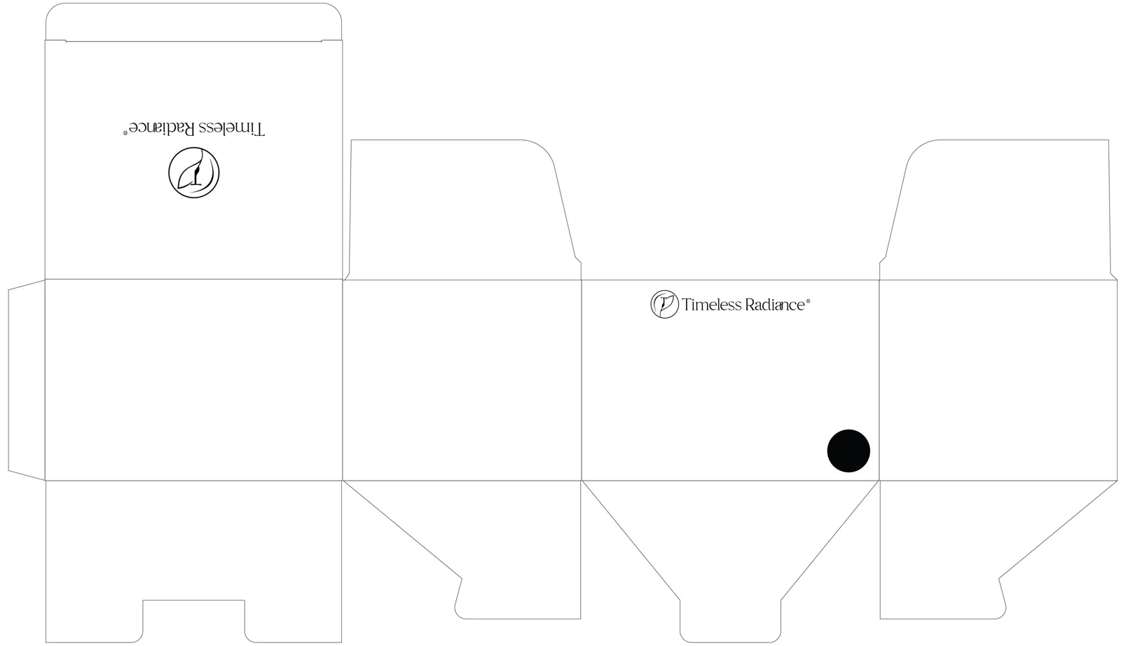
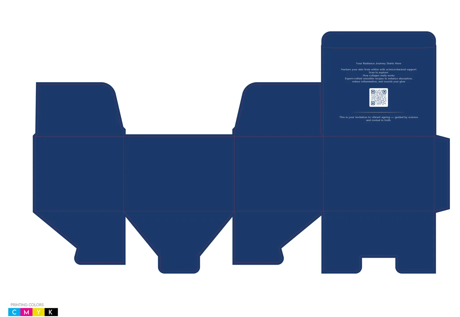
Each finish was prepared as its own plate on the same dieline as the CMYK artwork. Switch between the layers below. Finishes apply to the box only; the sachets print flat.
06 / Handoff
From design to print-ready files.
After review by the manufacturer and the brand team, the separator rules were simplified, the seal finalised and an inside-flap welcome message added, with a QR code to educational content and recipes.
- AIEditable sourceAdobe Illustrator artwork
- PDFPrint-ready filesAI and PDF for the manufacturer
- PLATESFinish platesSeparate emboss and spot UV
- 3DRendersCombined, box only and sachets only
Result
“I have a few other projects to do — Amazon pages and other packaging for other products — I would love to do with you.”
Related services: Cartons, mailers & display boxes · Structural packaging & dielines
Planning packaging like this?
Send your product, components, sizes and your supplier’s dieline. You’ll get a clear scope and quote.